%matplotlib inline
%config InlineBackend.figure_format = "retina"
Wavelets & Cone of Influence
This tutorial will show the main steps involved in Wavelet analysis using periodicity. As with other tools from the timefrequency module, the aim is to localize the periodicities in time. That’s specially useful for signals with additional information in their varying variance or fundamental frequency.
For a deeper theoretical discussion on Wavelet analysis, see the practical guide by Torrence and Compo (1998).
import numpy as np
import matplotlib.pyplot as plt

from periodicity.core import TSeries
from periodicity.data import SpottedStar
from periodicity.timefrequency import WPS
plt.rc("lines", linewidth=1.0, linestyle="-", color="black")
plt.rc("font", family="sans-serif", weight="normal", size=12.0)
plt.rc("text", color="black", usetex=True)
plt.rc("text.latex", preamble="\\usepackage{cmbright}")
plt.rc(
    "axes",
    edgecolor="black",
    facecolor="white",
    linewidth=1.0,
    grid=False,
    titlesize="x-large",
    labelsize="x-large",
    labelweight="normal",
    labelcolor="black",
)
plt.rc("axes.formatter", limits=(-4, 4))
plt.rc(("xtick", "ytick"), labelsize="x-large", direction="in")
plt.rc("xtick", top=True)
plt.rc("ytick", right=True)
plt.rc(("xtick.major", "ytick.major"), size=7, pad=6, width=1.0)
plt.rc(("xtick.minor", "ytick.minor"), size=4, pad=6, width=1.0, visible=True)
plt.rc("legend", numpoints=1, fontsize="x-large", shadow=False, frameon=False)
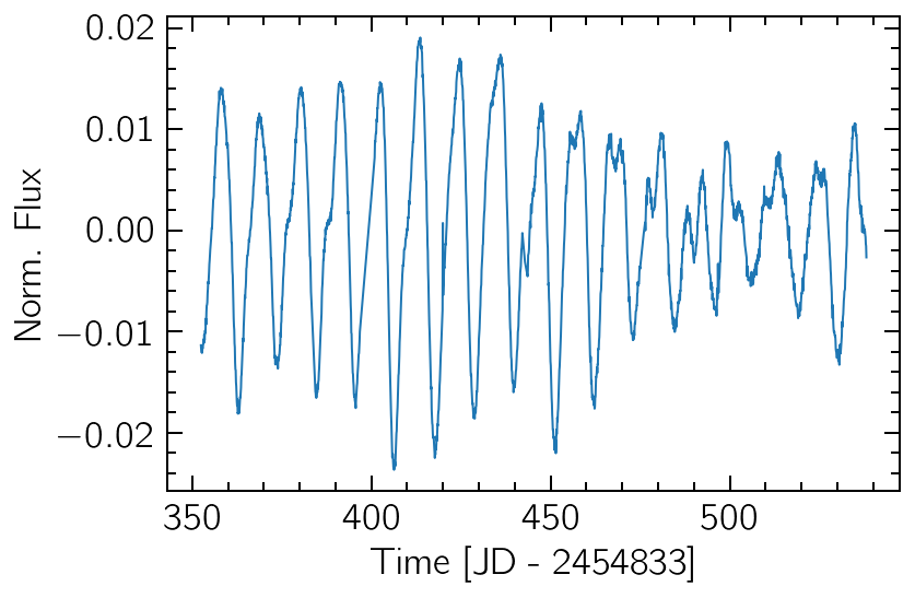
The data is taken from Kepler observations of the star KIC 9655172 from December 2009 to June 2010 (totaling six months or ~180 days). If we plot the data, we can visually detect a seasonality of ~10 days, with varying amplitude levels.
t, y, dy = SpottedStar()
sig = TSeries(t, y)

sig.plot()
plt.xlabel("Time [JD - 2454833]")
plt.ylabel("Norm. Flux");
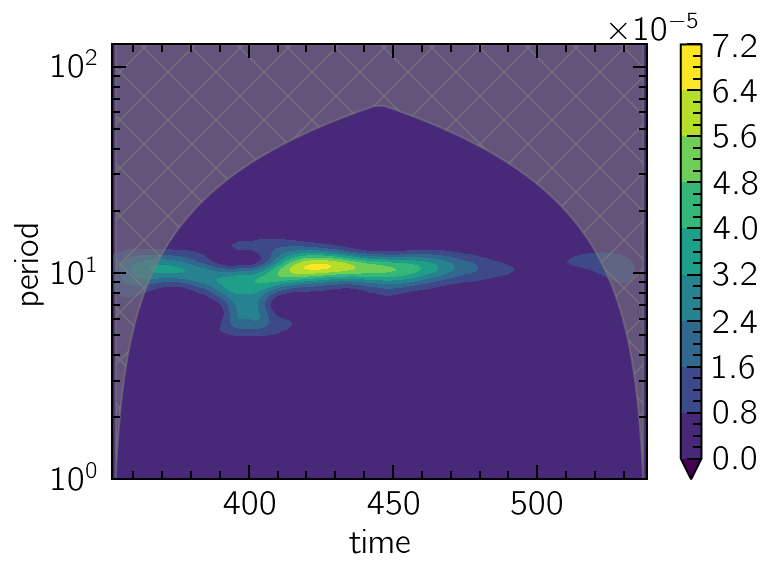
Plotting the Wavelet Power Spectrum
The creation of a new WPS object requires only a period grid on which to calculate the wavelet transform. A generally good advice is to use a log-uniform grid.
periods = np.logspace(0, 7, 1000, base=2)
wps = WPS(periods)
The created object can now be called with the input signal, returning a TFSeries which can be plotted and analysed with the usual tools.
More importantly, the plot_coi method will fill the area around the Cone of Influence, where edge effects become relevant.
spectrum = wps(sig)

spectrum.contourf(y="period", extend="min", levels=10)
wps.plot_coi(hatch="x", color="grey", alpha=0.5)
plt.yscale("log");
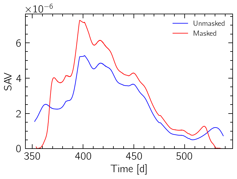
The Scale Average Variance (SAV)
The scale-average of the WPS, known as the SAV, is the projection of the representation on the time axis. It can give a good approximation on the variations of the signal variance with time.
The COI can also be used to mask out values on the edges.
wps.sav().plot("b", label="Unmasked")
wps.masked_sav().plot("r", label="Masked")
plt.ylim(0)
plt.xlabel("Time [d]")
plt.ylabel("SAV")
plt.legend(fontsize=12);
The Global Wavelet Power Spectrum
Similarly, by performing the time-average of the WPS, a global power spectrum can be obtained. This can be useful to determine the main persistent periodicity on the signal. Once again, the COI can be used to mask-out edge effects.
wps.gwps().plot("b", label="Unmasked")
wps.masked_gwps().plot("r", label="Masked")
plt.ylim(0)
plt.xlabel("Period [d]")
plt.ylabel("GWPS")
plt.xscale("log")
plt.legend(fontsize=12);
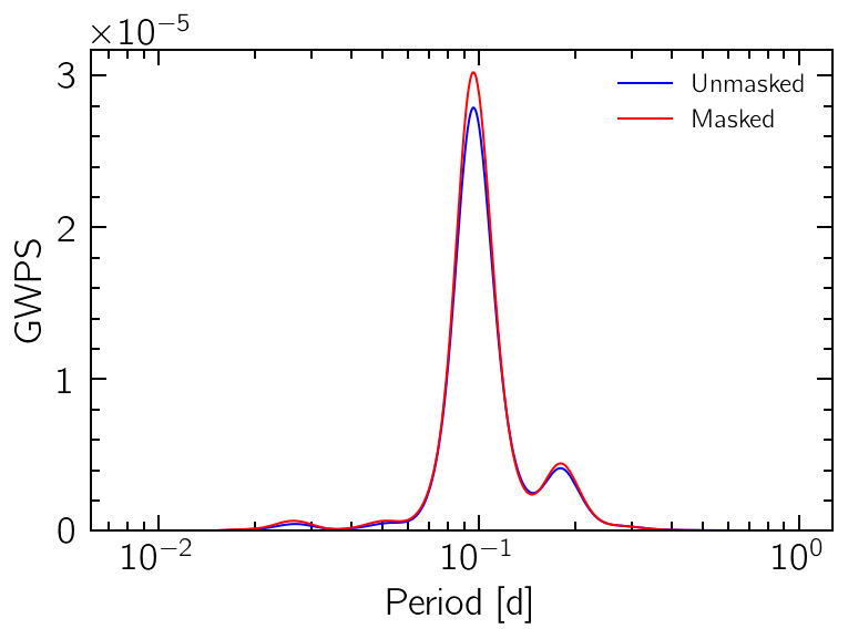
print(wps.gwps().period_at_highest_peak, wps.masked_gwps().period_at_highest_peak)
10.391826740281603 10.391826740281603